
Copycats media
Blog
We like to talk, like a lot. Sometimes we write about things that are important to our customers. And sometimes, well we just write things because we don’t know what else to do with ourselves.
WTF Are PMS Colors?
Welcome to our next installment of “WTF Is That?”
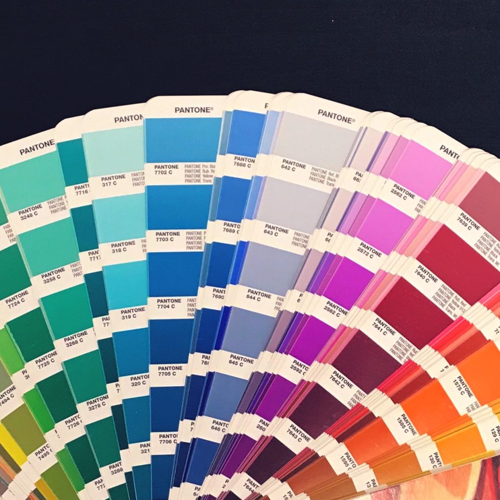
We will be tackling the elusive, Sasquatch of color: the Pantone Matching System. Also referred to PMS Colors.
So, what IS Pantone? Well, it’s actually just a standardized color system. Your regular office printer, or in our case–our large offset printers, use the standard CMYK printing (Cyan, Magenta, Yellow, and Key = Black) system. Pantone is just another way to specify colors. The difference of Pantone being that the color range is broader, and more exact than offset printing. Using Pantone you can even achieve metallics and fluorescent colors.
Back in the Mad Men era of design and printing, a brilliant soul decided to create the Pantone standardization of color, so that designers could easily match colors across different paper stocks, and better yet, different printers. It was so revolutionary that the technology really hasn’t changed over the years; we continue to use those PMS swatches in printing today.
You know that Target red? The red you’ve seen a million times over that when you see it, you KNOW it’s Target? That’s because they have a PMS Color picked for their brand. So no matter who’s printing their catalog, their in-store displays, or even their paper bags, it’s always going to be that same red so there will never be any inconsistencies across any of their printed pieces.
Say let’s just say you’re working with Copycats on your newest album. Now you may find that your sales rep is asking for you to pick a PMS Color for your disc face. Excuse me, what now? Like most places, Pantone is our standardized color matching system for silk screened projects, I.E. in this case your discs. So we may ask you to specify the colors, so we can get it right. There are hundreds of colors (err millions–I don’t know I’m not Bill Nye), and maybe that CMYK version you picked from your cover art, just doesn’t match exactly. While our designers and pre-press team are a bunch of talented magicians, sometimes it’s just better for YOU to pick the color since you know you want your art to look like. At the end of the day it’s your project, and we want you to be happy with the finished product that you give to your fans.
It doesn’t really HAVE to end at the discs, if you don’t want it to! You can always call out a Pantone to be used on your printed package. Maybe you do have a metallic that you want used on your digipak to match your disc. This would be a case where we would call out that specific color for printing on both the printed paper, and imprint face. Granted that may cost more, but that’s just one of the many things that Copycats can do in order to make your product uniquely custom.
And that my friends, is really all there is to it. If you didn’t know, now you know!
For additional tips, tricks, industry updates and more, be sure to subscribe to our blog!